Everything App and Game Developers Need to Know About iPhone X Screen
Some are argue that the new Apple flagship smartphone, the iPhone X worth the money. Some are also worried about the top notch, the cut off area for the front camera and Face ID components. However, non can argue that it is beautiful, it is powerful, and it has the best screen to body ratio on the market.
Even though the display is just gorgeous, it also makes app and game developers to scratch their head. It is because it is something they have never faced to in the 10 years of iPhone existence: Not just that it has curves on the corner and the notch on the top, but it also has an overlaying visible line at the bottom, called Home Bar.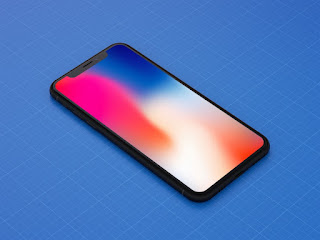

Now it does not seem too much, and that was Apple's intention, to not to take too much space away from the usable are of the screen. However, it is still there, and you should stay away from that place. Generally speaking you have 44 pixels less from the top and 34 pixels less from the bottom.

Before we go any further we need to explain something important. iPhone has three different screen resolution numbers: Logical, Rendered and Physical resolutions.
The Logical Screen Resolution or Points are abstract units app and game developers can calculate with. It really just helps you to design your screen for one device and use it on another one. The very best example is when retina display came out the first time with the iPhone 4. For both the 3GS and the 4 the logical resolution was exactly the same while the retina resolution was twice as much. Old apps with normal resolution images and fonts could run without issues on the new device, and then later on updating images to higher quality did not require to adjust the layout of the views.
Rendered Pixels is the number of pixels the graphical unit renders. Some devices use 1x, some use 2x and few other use 3x upscaling from the logical resolution. For example on the iPhone 4 retina display is 640x960 while the logical is 320x480. iPhone X uses 375x812 logical resolution, and after 3x upscaling you get the stunning 1125x2436 one.
Finally the Physical Screen Resolution is the real deal, usually people just refer to it as Screen Resolution. Most of the case this is the same as the rendered one, however, in iPhone 6+/6s+/7/8 there is a downsampling of 1:15 which gives you the 1080x1920 pixel dimension compared to the 1242x2208 rendered one. So again, on those devices an app developer works with 414x736 logical resolution, which is upscaled 3x to 1242x2208 and that is finally downscaled to 1080x1920. Weird, but that is how it works, and that explains why you cannot really pixel perfect lines for those devices.
For simplicity we are using logical screen resolution in this blog.
The iPhone X logical screen resolution is 375x812 pixels. Now the safe area is 375x(812 - 44 - 34) = 375x734. Obviously we need to calculate with the diagonal, so we need to recall our knowledge about Pythagoras theorem:

Or the other way around:
That means:
But that is in pixels. We also need the original diagonal pixel resolution,
which is:
That means if we have 894.41 pixels in 5.8",
then
therefore:
Now things are getting a bit worse in landscape mode. Why is that? Because in landscape mode we have even smaller safe area. That is because now the notch goes to the side, and obviously you want to keep your screen balanced right in the middle, leaving off the same size of unsafe areas from each side. And then Home Bar is still located at the bottom, so that takes away some area too:

It sounds disappointing, however, it is still much better than the 4.7" iPhone 6/6s/7/8 and with a background that stretches all the way to the edges it gives the user the impression that the useful area is actually the entire screen. Just keep in mind that placing buttons, labels and other user interaction elements onto the unsafe area is generally speaking not a good idea. The notch, rounded corners and the home bar can ruin the user experience, even though you can hide the home bar temporarily from the screen (that will come back as soon as user touches the screen). But for background or other aesthetics design elements can go there, and that includes media like video, still images, animations like game sprites and objects.
Comments
Post a Comment